Wes Anderson’s style is one of the most distinctive in contemporary cinema. So much so that viewers can recognise his work from a single image, whether it’s animation or live-action. While vintage flair, bold colour scheme and keen costume design are obvious components of this unique aesthetic, there are numerous subtle ways he creates his distinctive look. And it’s not all visual. The style of this singular auteur also evinces a particular warmth, as well as a sense of escapism and adventure, akin to reading by torchlight under the duvet covers at night.
With his new release Asteroid City in cinemas in June, we’ll be treated anew to Wes Anderson’s brand of cinema. To honour the occasion, let’s take a look at how he achieves this unique story-book aesthetic.

The Look
Colour can influence mood and create atmosphere. Artists use its psychological effects to evoke feelings in a viewer and to tell a story.
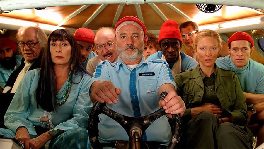
Anderson employs colour to an extraordinary degree. In The Life Aquatic with Steve Zissou (2004), there’s a prevalence of blue and orange shades in the sets and costumes, which reflect the marine environment and also echo the melancholy of Bill Murray’s titular character.
Zissou’s crew are all seen wearing matching blue uniforms and red knitted beanies. The woollen headwear is incongruous to the ensemble but is vital to the storytelling. (And reminiscent of the clothing worn by Jacques Cousteau, a character upon whom Zissou is clearly based.) Red is an emotionally intense colour and Anderson frequently employs it to represent grief. In this instance, Zissou is devastated by the loss of his friend and partner Esteban du Plantier, and his red beanie reflects this.

The Life Aquatic with Steve Zissou (2004)
In The Royal Tenenbaums (2001), we see Chas (Ben Stiller) wearing a red tracksuit to mourn the death of his wife and the sense of abandonment he felt growing up.

The Royal Tenenbaums (2001)
In The Darjeeling Limited (2007), the brothers are also seen driving a red car after the death of their father.

The Darjeeling Limited (2007)
In addition to colours connoting specific feelings, Anderson also presents a characteristic brightness, saturation and hue in his films. With Moonrise Kingdom (2012), he continued to embrace the aesthetics of his animated features, creating a world awash with yellow.
Anderson’s colour palettes are exaggerated and prominent, instilling a sense of nostalgia and harking back to his 1980s childhood. The other effect of his elaborate use of colour is that he creates a world far removed from reality. This means he can get away with a more fanciful plot and outlandish storylines because it all takes place within what is perceptibly a contrived reality.
Symmetry
Anderson is renowned for using symmetry in his films, which creates a sense of harmony and balance. While pleasant to watch, this kind of composition also contributes to the fanciful, beguiling appearance of his films.
In almost every shot there is this symmetry. Those that focus on a single character almost always place them in the centre of the frame, and where there are multiple characters, they often mirror each other on either side of a central point of the composition.
This attention to symmetry also helps create a tableau effect, making shots seem nearly two-dimensional and appear like a series of paintings, which is key to creating Anderson’s signature style.
Composition
Planimetric composition refers to the technique of making backgrounds seem flat in contrast to central figures in the foreground. Anderson makes liberal use of this and the constructed tableau vivant result heightens the highly constructed feel of his films.

Moonrise Kingdom (2012)
Set Design
Production designer Adam Stockhausen won an Oscar for creating the imaginative and fanciful set of The Grand Budapest Hotel (2014). He stated that Anderson has a very specific visual style and he outlines his vision meticulously. This necessitates that the set is designed frame by frame and adheres to Anderson’s stipulations about colour.
Stockhausen described how they used the interior of a derelict hotel in Görlitz, Germany, for more than a dozen of the film’s sets. In his role as art director on The Darjeeling Limited, Stockhausen designed a whole train-cart interior and an exact copy of it facing the other direction.
Stockhausen’s collaboration with Anderson has helped create the aesthetic he is so well known for in his films, although the production designer gives full credit to his director’s vision.
Costumes
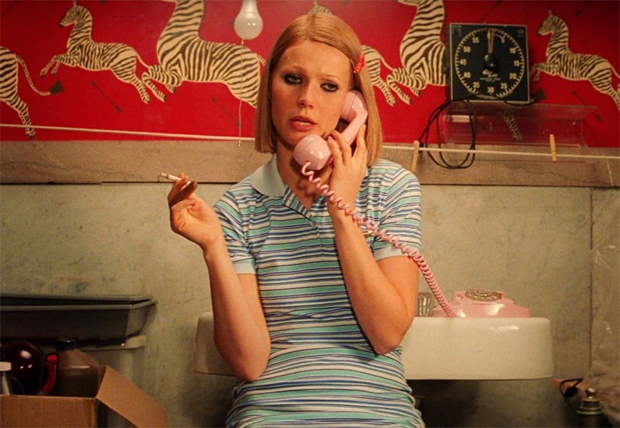
The costumes in Anderson’s films are crucial for enhancing characterisation. Perhaps the best examples of this can be found in the clothing worn in The Royal Tenenbaums, designed by Karen Patch. Take Margot Tenenbaum’s (Gwyneth Paltrow) long fur coat. It reflects her icy and distant exterior, while also acting as a thick, warm layer of protection from the world.

The Royal Tenenbaums (2001)
Her various tennis dresses, on the other hand, connect her to her former tennis-star brother and give her an infantilised appearance.

The Royal Tenenbaums (2001)
Props
Props are just as important to creating a unique film world as the set and costumes. Kris Moran worked as a set decorator and prop master on several of Anderson's films, including Moonrise Kingdom and The Royal Tenenbaums. Moran and her team work from Anderson’s detailed storyboard to bring the film to life.
Moran credits eBay, thrift shops and antique warehouses for helping her find the perfect props. These vintage items and perfectly placed props are integral to the overall stylisation of Anderson’s films.
Cinematography
The cinematographer Robert Yeoman has worked on all of Wes Anderson’s live-action movies, including the upcoming The French Dispatch.
As symmetry is so important to Anderson, Yeoman has stated that he measures to ensure that the camera is exactly in the centre of every shot. He also prefers to use the sun as his main source of lighting, bolstered by soft illumination to reflect the optimism and comedy of the films.
Another key characteristic of Yeoman’s cinematography is slow-motion, which usually features in closing scenes. One striking example of this is Margot’s exit and walk from the bus to the station in The Royal Tenenbaums.
Yeoman’s contribution to the specific look of Wes Anderson films cannot be underestimated.
Auteur Inspiration
To better understand the unique look of Wes Anderson movies, it’s important to look at the directors and films that inspired him.
Japanese filmmaker Yasujirō Ozu’s style and subject matter made a big impression on Anderson. In The Royal Tenenbaums, for example, we see a dysfunctional family marred by separation and betrayal, which mirrors Ozu’s similarly domestically themed Tokyo Story (1953). The use of the home as the central setting for the film and the distinct framing of hallways, doors and stairs to emphasise perspective and discord are seen in both The Royal Tenenbaums and Ozu’s masterpiece.

The Royal Tenenbaums (2001)
Indian director Satyajit Ray’s 1955 film Pather Panchali also had a profound effect on Anderson, inspiring The Darjeeling Limited (2007). We can see this most clearly in the final scene where Jack (Jason Schwartzman), Peter (Adrien Brody) and Francis (Owen Wilson) chase after the Bengal Lancer train.

The Darjeeling Limited (2007)
This mirrors the closing scene of Pather Panchali, which shows the central characters running across a meadow as a train passes by. Anderson also borrowed original music from Ray’s film.
Anderson has often cited Mike Nichols as a great source of inspiration and this can be clearly seen in the parallels between Rushmore (1998) and Nichols' The Graduate (1967). A clear example of this are shots of the protagonist appearing behind a fish tank that occupies the whole frame.

Rushmore (1998)

The Graduate (1967)
Anderson has modelled some of the themes of his films on the absurdism rife in the work of French New Wave directors François Truffaut and Jean-Luc Godard. He has also stated that he was very influenced by Roman Polanski’s particular style of staging and shooting scenes.
He was able to learn from these masters of filmmaking in order to hone his own style, as well as paying due homage to the directors who shaped him.
Wes Anderson’s Style
We can all recognise it easily, but how exactly can we describe Wes Anderson’s film style?
Firstly, his work falls into the category of postmodernism. This can be defined as the intentional mixing of styles from different time periods, with a thematic focus on capitalism and over-consumerism.
The anachronistic props we see in his movies, like the retro televisions, typewriters and photo booths mixed in with art deco interiors, all contribute to this blend of styles characteristic of postmodernism.

The French Dispatch (2021)
A comment on modern-day consumerism, meanwhile, can be seen in the contradictory central character in Fantastic Mr. Fox. Mr Fox (George Clooney), who wears designer trousers and discusses interest rates and housing prices is, at his core, a common red fox constantly at odds with his nature. He laments, ‘How can a fox ever be happy without (forgive the expression) a chicken in its teeth?’
The lies and deception of Gene Hackman’s character in The Royal Tenenbaums, meanwhile, are discovered due to his consumption of fast food and sweets.
Another keyword used to describe Wes Anderson’s style is formalism. The opposite of realism, this refers to a more stylised form of filmmaking that uses lighting, sound, music, set design and colour to help tell the story. As we already know, Anderson relies heavily on colour and setting to illustrate his narrative and is probably one of the best known formalist directors of our time.

How Has Wes Anderson’s Style Influenced Cinematography and Design?
Wes Anderson’s distinctive film style has had a big influence on modern culture and design and can be seen almost everywhere. In fashion, a huge number of big-name brands, including Lacoste, Gucci and Louis Vuitton have channelled The Royal Tenenbaums in their collections. Anderson has also left his stamp on the commercial sector, directing adverts for American Express and H&M. Since then, his particular style has been seen replicated widely in the advertising world.
The decor of his films has also been influential, with his films’ ubiquitous Scalamandre zebra-print wallpaper becoming hugely popular in fine-dining establishments around the world. Music producer Mark Ronson revealed that he has this wallpaper in his home.
The director’s aesthetic mark can also be seen in Accidentally Wes Anderson, a book and website dedicated to unique architecture and scenic spots that hark back to Wes Anderson’s cinematic vision.


