For the release of The Human Voice, we spoke to Pedro Almodóvar's long-time collaborator Juan Gatti about his creative process, what it's like to work with such a visionary filmmaker for so long, and what inspired his latest creation, the inspired poster artwork for Almodóvar's latest release, The Human Voice, starring Tilda Swinton.

CURZON: Can you recall the first time you met Pedro Almodóvar and your first collaboration?
Juan Gatti: I don't remember exactly when I met Pedro, but it was in 1985. Our first collaboration was for the movie Matador (1986) and it consisted of graphic design on an illustration by Carlos Berlanga.
You have worked together many times since. Are you able to articulate what it is that has forged such an enduring creative partnership between you?
I believe that the lasting collaboration is due to the fact that, in a way, we have grown together with common interests and an understanding between us, I know what he likes and the most important thing is that I know what he does not like.
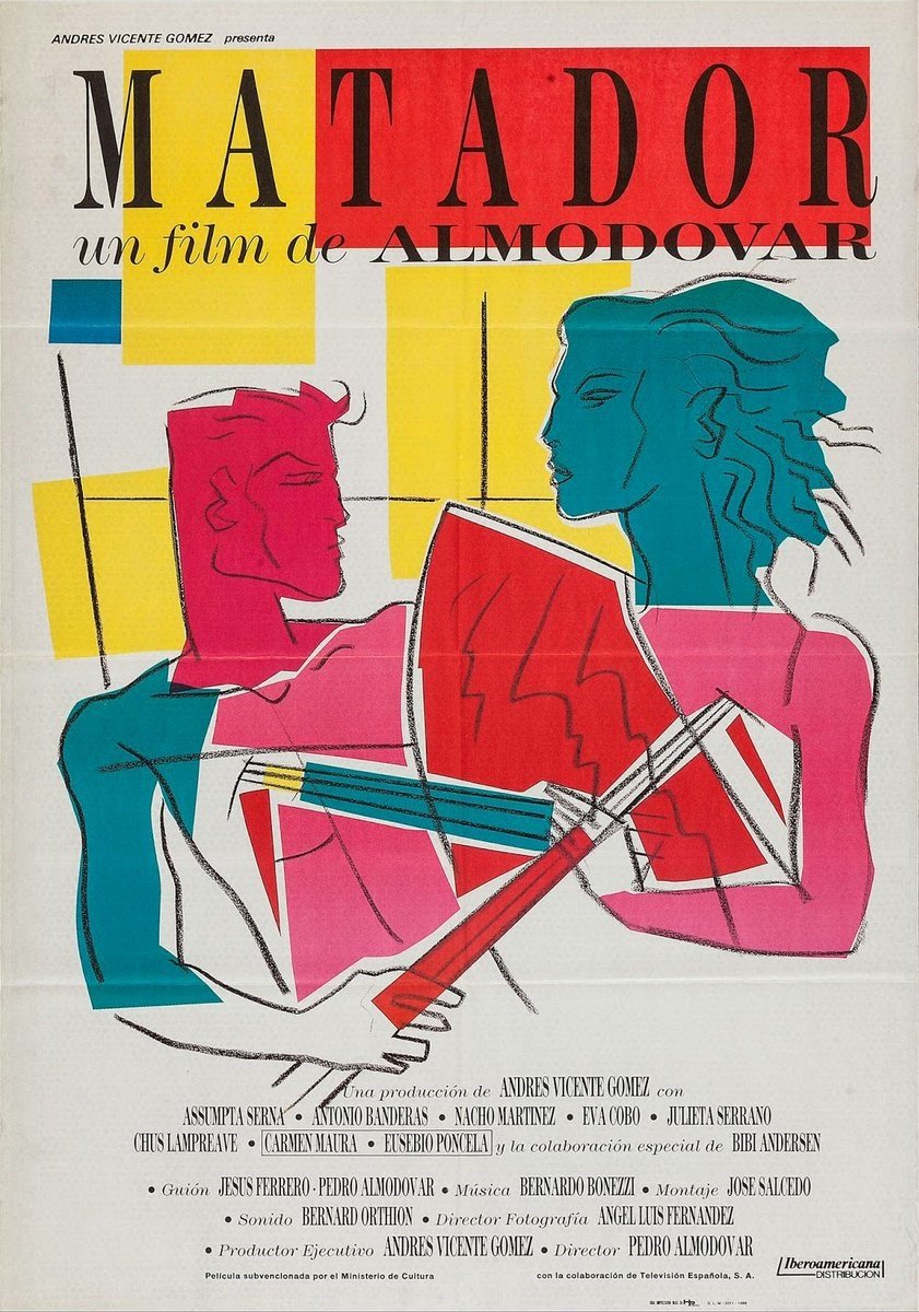
Matador (1986) poster
How do you like to work together? Is there a creative brief? Or does the finished film act as sole inspiration? Are you involved in the production, or do you wait until the film is finished before you begin work on an artwork?
In general, I start to get involved in the films from the script and during pre-production I am in direct contact, because in all films I work on graphic elements that appear as props in them.
Can you tell us about your initial reaction to seeing The Human Voice? What were the visuals and ideas that inspired you?
My reaction was about the great poetry that I saw in it. The Balenciaga suit and the beginning when she goes to the hardware store marked me a lot aesthetically.
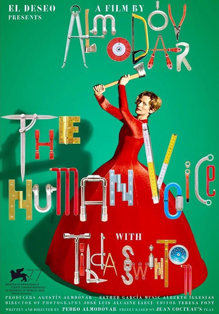
The Human Voice (2021) poster artwork
The Human Voice reworks a play by Jean Cocteau. Do these influences inform the work you do? Are there any other external influences that play a part in the artwork?
In this case there was no influence from Cocteau (artist who I admire), the influence is entirely Almodóvar and his point of view on the play.
Our readers are fascinated by the design process and many are artists themselves. What materials do you like to work with? (for example: photography and collage, paint and hand-drawn, do you work with canvases or digitally?)
In general, there is no common technique in the posters and titles that I have made for Pedro. I have used photography, collage, drawings and other techniques that I thought corresponded to the image I wanted to convey in each case.
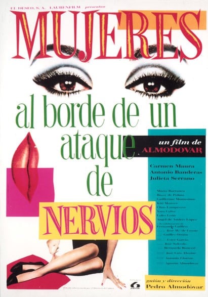
A Woman on the Verge of a Nervous Breakdown (1988) poster
What materials did you work with for The Human Voice artwork?
For The Human Voice I worked on digital collage
Were there multiple concepts along the way to the final artwork? What is the process for refining the final piece?
It really was the first one I made that was used. After that there were some doubts on the part of the marketing department and after some unsuccessful attempts they returned to the original idea.
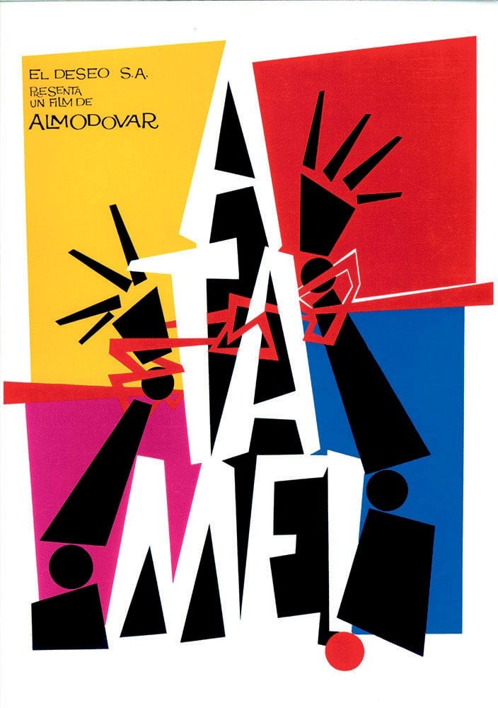
Tie Me Up! Tie Me Down! (1989) poster design
What do you think of the current state of poster design and the prevalent trends? Are there trends you see in cinema posters that you like or that you cannot stand?
In general, this 'moment of the posters' does not interest me. I think that currently the choice of posters is in the hands of the producers and that the directors do not participate. The main thing is the face of the actors and a small vignette, usually at the base of the poster, with a scene from the film. I think that commerciality predominates to the art in current posters.
In general, when I make a poster, what I want above all is to capture the attention and interest of the public eye, and I always want to tell you something about the film with the fewest possible elements.
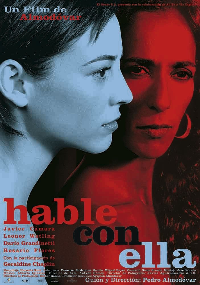
Talk To Her (2002) poster
Is there a particular era of poster designs that you consider to be a golden era for film artwork? And do you have a favourite film poster?
I believe that the decades of the 50's and 60's were the times of the great poster artists, when in an almost abstract way the film was told and a graphic element was predominant.

Book tickets to see The Human Voice in cinemas

